Logos, colours
and type.
For partners, event organisers and anyone writing about Black Lab Studios. Use the files as they are, without changing the colours or the shapes.
Need something that isn't here? Email [email protected].
The name.
NameThree words, three capitals, always in full.
Black Lab Studios
On a contract or an invoice: Black Lab Studios, Lda.
- BlackLab Studios
- Black Labs Studios
- Black Lab
- Blacklab
- BLS
Describing us.
Use these as they are, or cut them down.
A developer education and software company. We teach, we make, and we create.
Black Lab Studios is a developer education and software company, founded by Gui Ferreira and based in Porto, Portugal. It teaches through self-paced courses, live cohorts and hands-on workshops for engineering teams. It makes ThatPrompt, a prompt manager for Mac and Windows. And it publishes a weekly newsletter and videos on AI and software engineering.
The logo.
Logo · 5The symbol is the profile of a Black Labrador, drawn down to the fewest lines that still read as him. Charcoal goes on light grounds, White on dark ones.
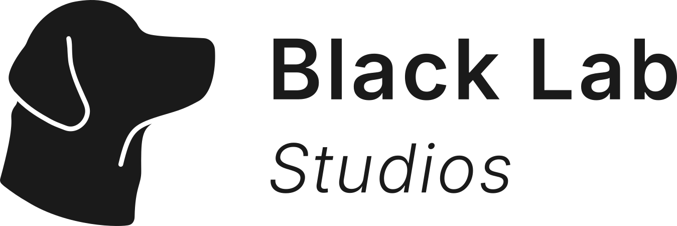
Primary logo
The default. Websites, slides, posters and anything printed. When in doubt, use this one.
Never narrower than 180px.

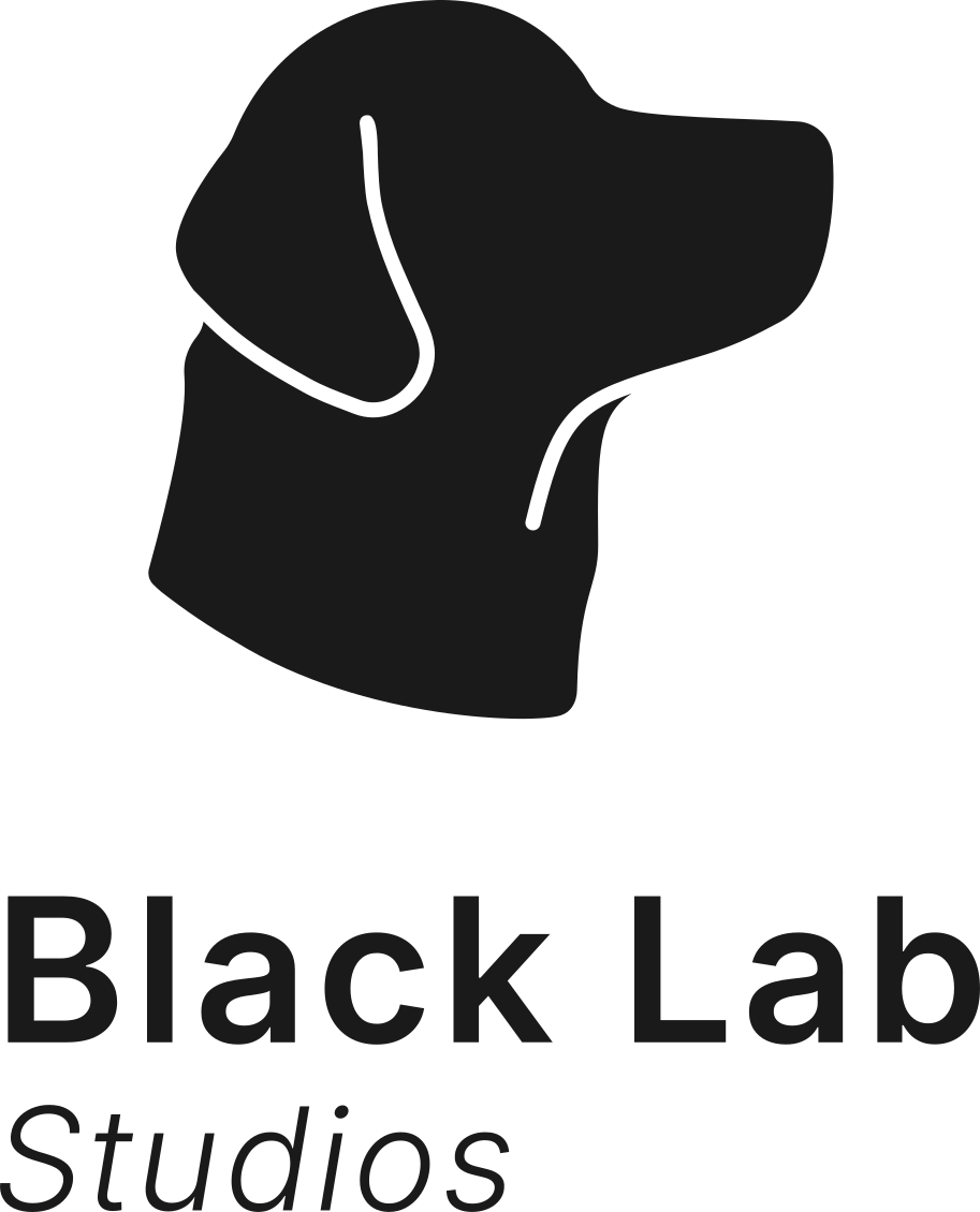
Secondary logo
Stacked, for square and tall spaces where the primary logo would end up too small.
Never narrower than 140px.

Wordmark
The name alone. For when the symbol is already nearby, or a quieter signature fits better.
Never narrower than 120px.

Symbol
The dog on its own, once the name has already been said somewhere close.
Never narrower than 32px.

App icon
Profile pictures, social avatars and anywhere a square tile is expected.
Space and size.
Leave the height of the capital B clear on every side. Nothing else goes inside it.
Each logo above lists its narrowest width. Below it, the details close up and stop reading.
Use the files, don't redraw or retype the logo. SVG wherever the tool takes it, PNG where it doesn't.
What not to do.
Each of these breaks the logo. So does pulling the symbol and the name apart to rearrange them.
The colours.
ColourNeutral on purpose. Charcoal and Off White do most of the work. Click a hex to copy it.
FoundationCharcoal
RGB 26, 26, 26
Text, and the dark ground.
Off White
RGB 246, 244, 241
The light ground.
White
RGB 255, 255, 255
Cards on light, text on Charcoal.
Pampas
RGB 221, 216, 196
A warm panel. Sparingly.
Charcoal 80%
RGB 72, 72, 72
Secondary text.
Charcoal 60%
RGB 117, 117, 117
Large text and headings only.
Charcoal 40%
RGB 163, 163, 163
Rules and borders. Never text.
Charcoal 20%
RGB 209, 209, 209
Rules and borders. Never text.
Charcoal on Off White is 15.9:1, and White on Charcoal is 17.4:1. Both pass AAA at any size, so those are the two pairings to reach for.
Rock, Meadow Mist, Warm Clay and Lavender are kept for the products. Leave them out of work about the company. ThatPrompt has its own page at thatprompt.ai/brand.
The type.
TypeInter, and nothing else. SemiBold for headings, Regular for text, Light Italic for the odd quote. Sentence case everywhere, buttons included.
H1
SemiBold 56/64, -2%
We teach, we make, and we create.
H2
SemiBold 40/48, -1%
Simplicity above all.
H3
SemiBold 28/36
Craft over volume.
Body
Regular 16/28
We'd rather ship four good things a year than forty forgettable ones.
Caption
Regular 14/20
Based in Porto. Shipping since 2006.
Accent
Light Italic 16/28
Better every day.
Need another
format?
A vector file for print, a different size, the logo on a particular colour. One email and we'll send it.
[email protected]We reply within two working days.